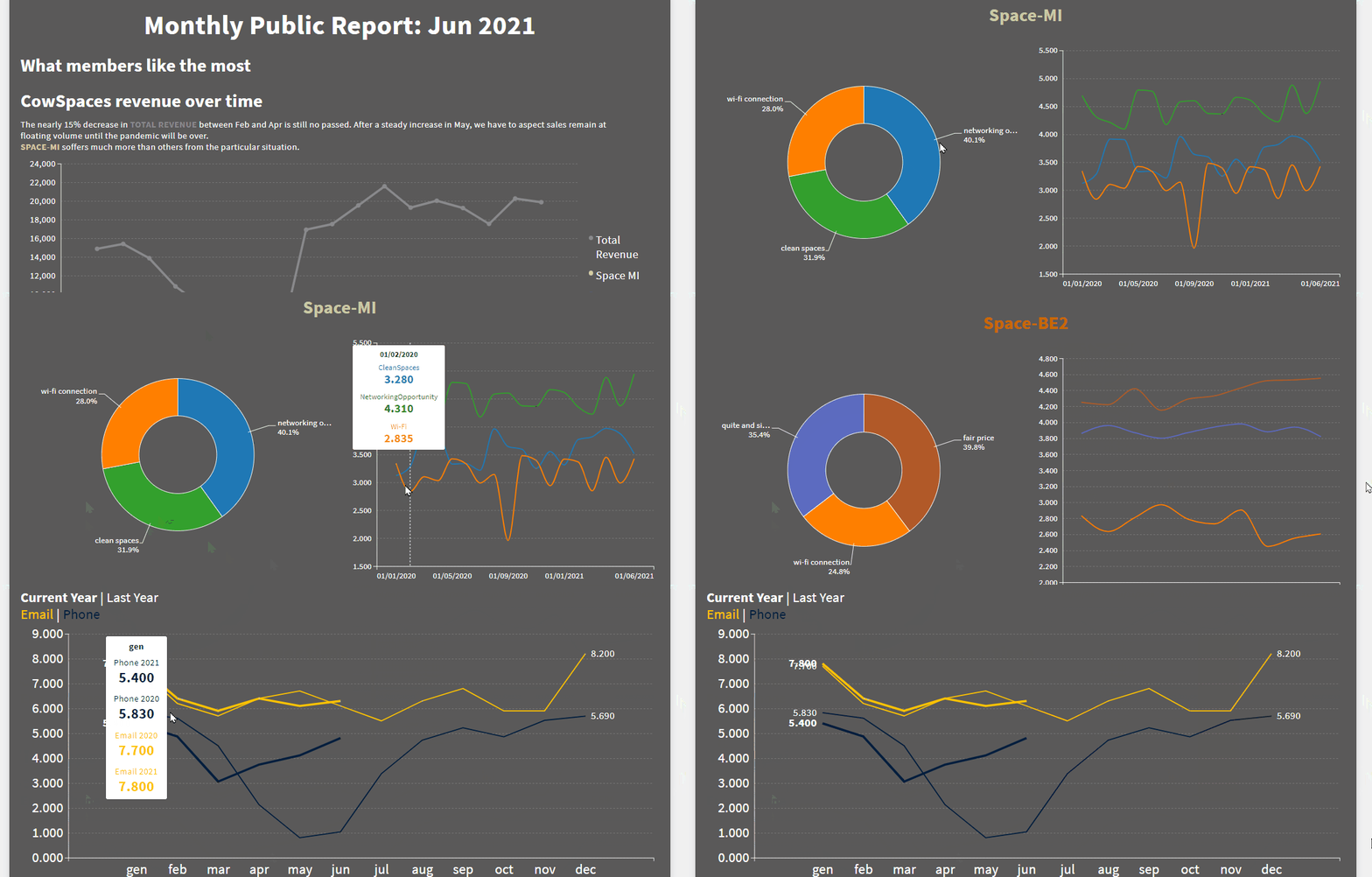
Easily create immersive data driven storytelling. Dive the reader into your story with interactive charts, maps and tables in a clear and compelling way!

Have you collated fantastic and interesting data
but you are not sure how to tell it effectively?
Effortlessly create captivating stories with Bstreams
Bstreams storytelling features will help you create data-driven stories in order to make faster and better decisions on how to organise your business’ time and resources. Your audience can learn more about you, your purpose and your business. Everyone will focus on what really matters.
Data-Driven Digital Storytelling: how to tell effective stories with data
Thanks to the art and science of storytelling you can tell the data in an effective and understandable way for everyone. As we know, it is not enough to just analyse data. You must be able to communicate the story. The most important thing to remember is that numbers are not easy to understand and remember, yet they will suddenly appear meaningful thanks to the power of data driven storytelling. For example, when narrative is combined with data, it will visually explain why something is important and will allow your audience to remember it more easily.
Data-driven stories are created by analysing complex and large datasets. It is possible to filter your data and tailor your stories for a specific audience. Just remember that in order to be telling an effective data story, it is always necessary to use data visualisation. BStreams’ interactive charts, maps, and tables can shed light on some insights that would otherwise go unnoticed.
BStreams allows you to easily build stories with data in a clear and compelling way. And it’s free! But let’s go step by step, starting from the meaning of data storytelling. Discover how you can generate value from data representation…
What is data-driven storytelling?
Data-driven storytelling is the ability to turn more or less raw data into easy-to-understand stories. It’s a way to effectively communicate insights from a dataset, through visualisation and narratives. According to Gartner, data storytelling will be the most widespread means of consuming analytics by 2025.

The data storytelling process follows a very specific path:
- Data is collated.
- Data is represented with images, graphics, charts, animated tables
- Data is finally narrated, by intertwining the information that leads the audience from point A to point B, clearly and never boring.
BStreams has a specific goal: helping you to associate data with a story and create an emotional connection with the facts and with the audience. You can say goodbye to arid Excel sheets in your presentations.
What are the key components of data storytelling?
- Data (of course!). Thorough and accurate data analysis is the foundation for your data story. What types of analysis to use? Simple, all those at your disposal to give a complete picture: descriptive, diagnostic, predictive and prescriptive analysis.
- Narrative. Choose a verbal or written narrative, whichever you prefer or require. The storyline that you are telling will serve for the communication of the insights that are retrieved from data collection, defining the context that you are referring to, and directing your audience toward the actions that you would like to inspire.
- Visualisations. Visual representations of your data and narrative, can be useful for communicating each story clearly and memorably. Charts, graphs, diagrams, pictures, and animations: you have plenty of options.
Here are some sources:
- scientific research
- articles and websites
- information collected daily
- any kind of surveys
- official statistics
- customer database
As well as any other source that is sufficiently rich and reliable, of course.

Data storytelling with BStreams is super easy
Creating a story with BStreams is not only free but also easier than creating a presentation with any office program.
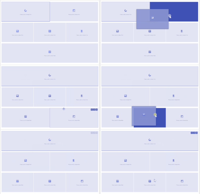
The views are arranged in one to three columns (for an almost unlimited number of rows!) which makes BStreams ideal for data storytelling.
The narrative flow can be emphasised by customising the size of the views, the separation spaces between the graphic elements and the addition of images and texts.
The final layout achievable with BStreams is clean and clear, and will help your referent understand all the elements arranged on the stream.
Add highlights to point out relevant items on visualisations. Enable filters and drill-to-charts to enrich the interactive user analysis experience.
Publish your story on the web, share it on social networks or use it in your documents.
It’s like shooting fish in a barrel!
The power of data-driven storytelling
Stories have always been a proven instrument for teaching, explaining, and influencing. Humans have told stories since the time of cave paintings to communicate, divulge, record. Why have stories been so popular since the dawn of humanity?
Our brains prefer stories over pure data because visual information is so much easier to remember. This is helpful when there is so much to process and retain.
Thanks to Bstreams you can conveniently put the data insights in the right context and move the actions from your audience (employees, collaborators, readers, whoever they are) because your data will be well received and retained through data-driven storytelling.
Use data storytelling to do best whatever you do
Data storytelling can be used internally, to effectively explain problems to be solved, show improvements to be implemented, or display the achievement of new goals. For example, you can explain through data-driven storytelling why it’s the time to change a business process or communicate the need for product improvements based on the user data. Yet you can also present the achievements of one of your teams to inspire the work of the others.

The sky’s the limit: what you can do with BStreams depends only on your area of interest and the data at your disposal.
Data storytelling can also be used externally, for instance to create a presentation aimed at your customers to buy your services, for teaching/CPD purposes, inform your audience and tell stories from a different point of view.

Tips to build your data storytelling
Data storytelling needs the same narrative elements as any story you’ve read or heard in your life. All you have to do is add:
- Characters
- Setting
- Conflict
- Final resolution
Characters could be your employees, stakeholders, or customers. They do not need to be included in your oral or written presentation but you should define the key players beforehand.
Set your scene by describing the situation that moved you to create a story-driven by data. Use the right type of data visualisation to make your setting more effective.
When it comes to conflict, describe the problem or your thesis (what you want to prove) at the root. Add data and external research, cite authoritative sources to support what you are claiming, and give examples.
If there are no conflicts in your data story, for example if the data shows that your sales campaign has exceeded expectations, you can jump straight to the conclusions.
Whatever story the data tells, you can communicate it effectively by formatting your narrative with BStreams and guiding your audience through each piece with the help of our stunning visualisations.
BStreams is a free storytelling software that lets you tell your story whenever you want, thanks to responsive views.
BStreams, storytelling made easy

Boost collaboration
Invite your teammates: you can work togheter on the same page.

Choose the view you prefer
In one to three columns for as many rows as you want. Our reporting tool is perfect for every need and guarantees clear and captivating results.

High level of customization
You choose the size of charts and maps, how much margin to leave between the elements, which colours to use and more.

Easy to make, even easier to read
Get an impressive result without being an expert. The final layout is clear and clean, designed to help anyone understand all the elements in the stream.

Fully responsive
You can read and share your bstreams on any device wherever you are. Embed your stories on your website without worries.
Say goodbye to boring spreadsheets forever!
BStreams helps you turn your data into stories. No dashboards and no spreadsheets: stories that anyone can read, understand, and share
- Easily choose the right data visualisation method
- Unlimited customization options and no need to code
- Create responsive data-driven storytelling suitable for all devices
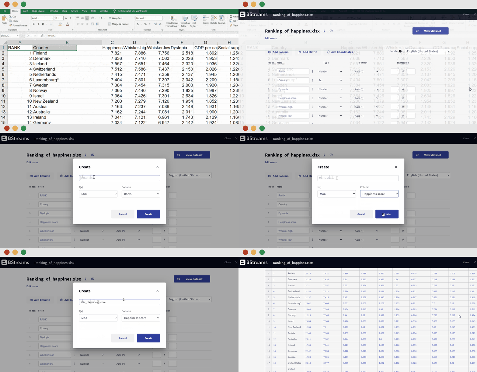
- Upload your data once, and update when you need it in real time


