Represent graphically large amounts of data quickly and easily with interactive charts, maps and tables. Leave your audience in awe and inspire new ideas and actions!

Does your business run on data but you struggle to visualise it?
Thanks to Bstreams you can easily show trends and insights!
Bstreams charts, maps and tables quickly communicate huge amounts of data at a glance, even in a small space.
Give your reader the chance to explore findings in a personalized way!
Get a professional result without having a specific background: no coding or graphic design skill required.
Online Data visualisation tool for business: bring out the best in your data
An image is worth a thousand words but when referring to data visualisation, this number grows exponentially.
Data visualisation is vital for a number of businesses because it provides an easy way to communicate complex information using visual elements. Thanks to data visualisation you can:
- identify what factors influence consumer behaviors
- discover your organization’s areas that need improvements
- forecast sales volumes
- make (of course!) any type of data more engaging
and more…
According to Project.co, 46% of businesses say they have lost customers due to ineffective communication. Poor communication can cost you revenue, customers and even employees!
Thanks to BStreams you can transform spreadsheets (as we know you always use them) into beautiful and interactive online presentations in just a few steps. Leave behind poor communication starting today: Bstreams is free and simple to use!
What is data visualisation?
Data visualisation combines numbers, information and graphic elements like graphs, charts and maps to communicate data in a more effective and visually appealing way.
When representing your data graphically, you make it more interesting for the reader but, above all, you make complex information easier to understand. Want to know more? Well, data onlookers will be able to both seeing your point of view as well as having the chance to “investigate” the same data in a personalised way.
Good data visualisation vs bad data visualisation
To obtain an effective data visualisation, these are the rules.


Be mindful! As your result must be beautiful but legible, juicy but easy to understand – how do you get it all this done?
Data visualisation foremost has to accurately convey your data. Elements like fonts dimensions, colors, alignments, highlights and right charts for each group of data are required to keep everything clear at a glance. Now you’ve carefully prepared your data but your job is still far from over…
Not having the right professional skills can make you feel overwhelmed especially because of all the details you need to finalise your data visualisation.
BStreams is your magic wand! Choose the visualization right for your data among a lot of predefined charts and maps. Just drag and drop the elements you need: in a few easy steps and you’re done!
Data visualisation common mistakes
Data analysis and graphic design aren’t skills that overlap often. If you do not have the right professional background, you can easily make data visualisation mistakes which cause information to be misrepresented. You really risk confusing your audience.
Check out these five common mistakes that are very easy to make if you don’t use the right online data visualisation tool for businesses.
Choosing the wrong graph
A common mistake is to choose the wrong graph and unknowingly designing a bad visualisation that misleads readers. This can cause a cascading failure phenomenon. The wrong chart skews both the data and the message!


Lack of context
It happens when you share the data visualisation as it is, without giving it a context. Consequently, everyone sees what they want, resulting in something completely different from what the data really tells. When you create a chart from spreadsheets and show it as is it, often appears out of context!
Incorrect Color Use
Misusing color is easy done, if you don’t have graphic design skills. The color palette is huge, which can lead to you using too many or too few colors. The most important thing to keep in mind is that whatever color you use, it should be with a purpose in mind.


Messy Graphics
Surely you experimented this: the strong temptation to include as much data as possible into a single graphic. It seems like an obvious mistake, but it happens more often than not. Too many graphic layers and text boxes can make a data visualisation quite difficult (if not almost impossible) to understand.
Data visualisation with BStreams is super easy
All you have to do is add the data and BStreams will do the rest! Thanks to our tool you can graphically represent large amounts of data quickly and easily. Leave your audience open-mouthed and inspire new ideas and actions!
We have designed our online data visualisation tool for business to avoid common user mistakes including choosing the wrong chart, the rainbow effect (too many colors), overfitting, wrong font size, etc. Decide on the focus of your data and the intended message: once you are done choosing the right graph, with BStreams it will be easy as pie. And if you still have doubts we will help you with our free guides and our informative blog!

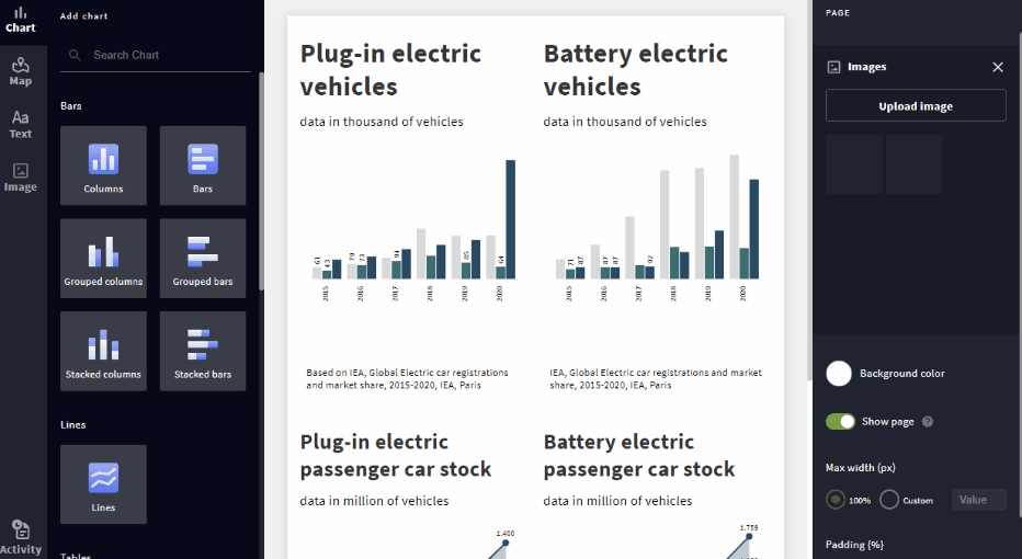
Thanks to Bstreams you can choose between a number of graphs and charts without losing your mind. Just to make some examples, this is what you’ll have at your disposal:
- Line charts
- Bar charts
- Bubble charts
- Pie charts
- Scatter charts
- Treemaps
And more…
Add context to your BStreams data visualisations in a few steps by including a legend or a text box. Choose colors to highlight information and compare or contrast data points. While using BStreams, each element of your data visualisation will tell exactly what you want to tell.
The power of good data visualisation
Businesses collecting data may find it very useful and interesting but if it is ill displayed, the target audience may find it difficult to understand. This is especially true when there is a huge amount of data to share.
To make facts and messages easier to absorb (because the intent is to promote action!) companies must use the right data visualisation tool that highlights and conveys the most important information clearly, without distortion.
Our eyes and our brain are drawn to colors and patterns. We can almost instantly distinguish a circle from a square, a bold text from a normal one, red from green. Our everyday life is dominated by images: we live in a visual culture. That’s why when we can see something instead of reading it or inferring it from lists of data, our brains immediately capture the information and internalise the message.
Have you ever looked at a huge spreadsheet of data and failed to see a trend, even if it was right in front of your eyes? That is why data visualisation is much more effective.

Use data visualisation to do best, whatever you do
A good visualisation tells your message free from the noise of raw data and highlighting the useful information. Use our online data visualisation tool for business to explain problems, promote actions, share your company’s goals. You will have many concrete benefits, for free!
For example, you can explain through your collected data why you have chosen to radically change the organisation of a department, what has been done by the company from a green perspective or create a map that shows where your employees work. You can tell how you use the budget for human resources, use data visualisation to empower brand awareness and much more.
There are no limits: what you can do with BStreams depends only on your area of interest and the data at your disposal. BStreams is perfect for any kind of storytelling you need, discover more here!
BStreams, data visualisation made easy

Any graphics you need
Get the right visualisation for your data choosing among our library of charts. Intuitively and logically tell the story that is hidden within the numbers.
Choose the view you prefer
In one to three columns for as many rows as you want. Our reporting tool is perfect for every need and guarantees clear and captivating results.

High level of customization
You choose the size of charts and maps, how much margin to leave between the elements, which colours to use and more.

Avoid common pitfall
No more mess with colors, data values or labes. BStreams is designed to support you producing the most uncluttered visualizations.
No longer need to stare at spreadsheets!
BStreams helps you turn your data into beautiful visualisations. No dashboards and no spreadsheets: visual data that can be understood at a glance and remembered easily
- Select the right data visualisation method without errors
- Access a wide range of charts and maps to suit all cases
- Extract the meaning of your data through awesome visualisations
- Benefit from easy and intuitive color management